How To Make A Homepage Of Your Dreams?
There are many different aspects that need to be considered while designing a blog. The goal is always to make it as appealing and functional as possible. The entire structure and layout of your blog is one of the most important elements, as it ensures that your reader has a pleasant experience.
Your blog's design also influences how likely it is for users to find it.
So if your blog were a house, the homepage would be the front door. It’s the main entrance to your online space. It doesn't really matter where your published posts will be featured, on a dedicated page or right here. Regardless, the homepage needs to captivate visitors' attention and convince them that your blog is worth exploring.
Why Is Homepage So Important?
A good homepage is a starting point, leading visitors through your blog and showing off your brand. Creating a good homepage for a blog is crucial for several reasons:
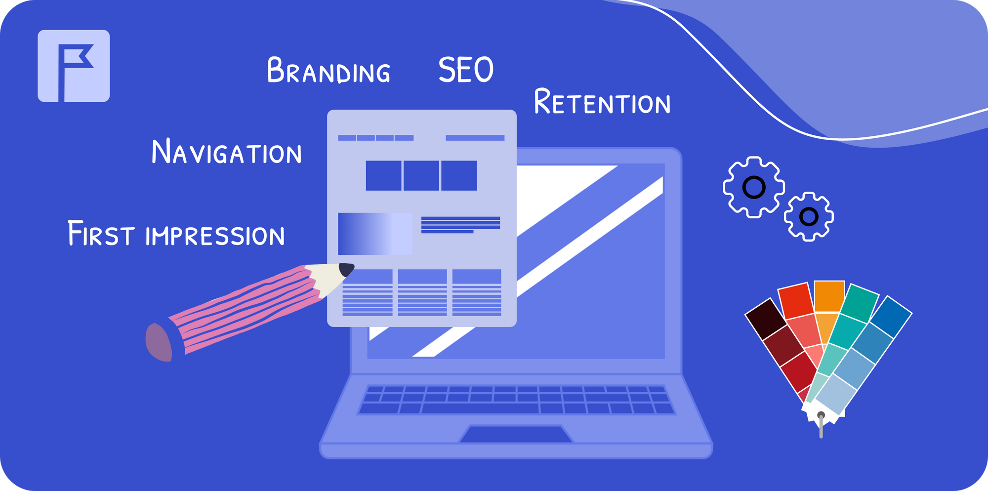
- First impression: the homepage is often the first interaction a visitor has with your blog. A well-designed homepage creates a positive first impression, encouraging visitors to explore further.
- Navigation: a clear and intuitive homepage helps users easily find content that interests them, improving their overall experience and prolonging visitors' stay on the site.
- Branding: the homepage sets the tone for your blog and helps establish your brand identity. Consistent design elements, like colors, fonts, and logos, define your brand and make it more memorable.
- SEO: a well-structured homepage can improve your blog's search engine ranking. Proper use of headings, meta descriptions, and keywords on the homepage can make your brand more visible in SERP.
- Retention: an engaging homepage can captivate visitors, and make it more likely for them to return. Features like recent posts, popular articles, and subscription options can boost reader retention.
10–20 Seconds
Something that you always need to keep in mind is after 10–20 seconds the magic will disappear. What is 10–20 seconds?
According to Nielsen Norman Group that’s how long, statistically, the average visitor will look at your site before clicking the back button. And that is not a lot of time to make a good first impression.
The good news is that based on that same study from Nielsen Norman Group, pages with a clear and distinct thesis can hold people’s attention for a much longer period of time.
Why The Default Blog Homepage Sucks
The default blog homepage doesn’t work because it’s not designed to be a blog homepage. It’s just a basic homepage with some blog posts on it. And that is certainly not what you need, if you want visitors to explore your blog further. When making a homepage for your online space, it is a good idea to include all the major design elements your visitors can see straight away. Make sure your audience is provided with quality content and a brief summary of what your site is all about.
Different Types Of Blog Homepages
By default, a blog homepage usually shows a list of your most recent articles and may have a sidebar, depending on the theme you use. But there are some more interesting types of blog homepages to look at.
Traditional Blog Homepage
A traditional blog homepage lists blog posts in reverse order, starting with the newest. Posts can be shown in full or as extracts, with links to older posts at the bottom. Early blogs often didn't have menus because they had no extra pages, so navigation wasn't needed.
Traditional homepages have a few problems. The content changes every time you publish a new post, so there isn't any fixed content for search engines to index. Your best posts quickly move down the page, and new visitors see only the latest content, which might not hold up to the standard, set by your top-ranking posts.
Static Homepage
A static homepage is different. It shows fixed content that doesn't change when you publish new posts. A static homepage looks more like a regular website. Modern blog homepages often combine static and dynamic content.
Hybrid Blog Homepage
A hybrid blog homepage mixes elements of both traditional and static homepages. It shows a mix of fixed content and your latest posts on the first page. This allows search engines to index the fixed content and understand the blog's purpose, while also keeping the homepage fresh with new posts.
Upside Down Homepage
An upside down homepage is a type of hybrid homepage with one main difference: it has a large feature area at the top that looks like a footer but is placed at the top. The idea is to make sure visitors see your most important call-to-action (CTA) first.
What Should Be On Your Homepage?
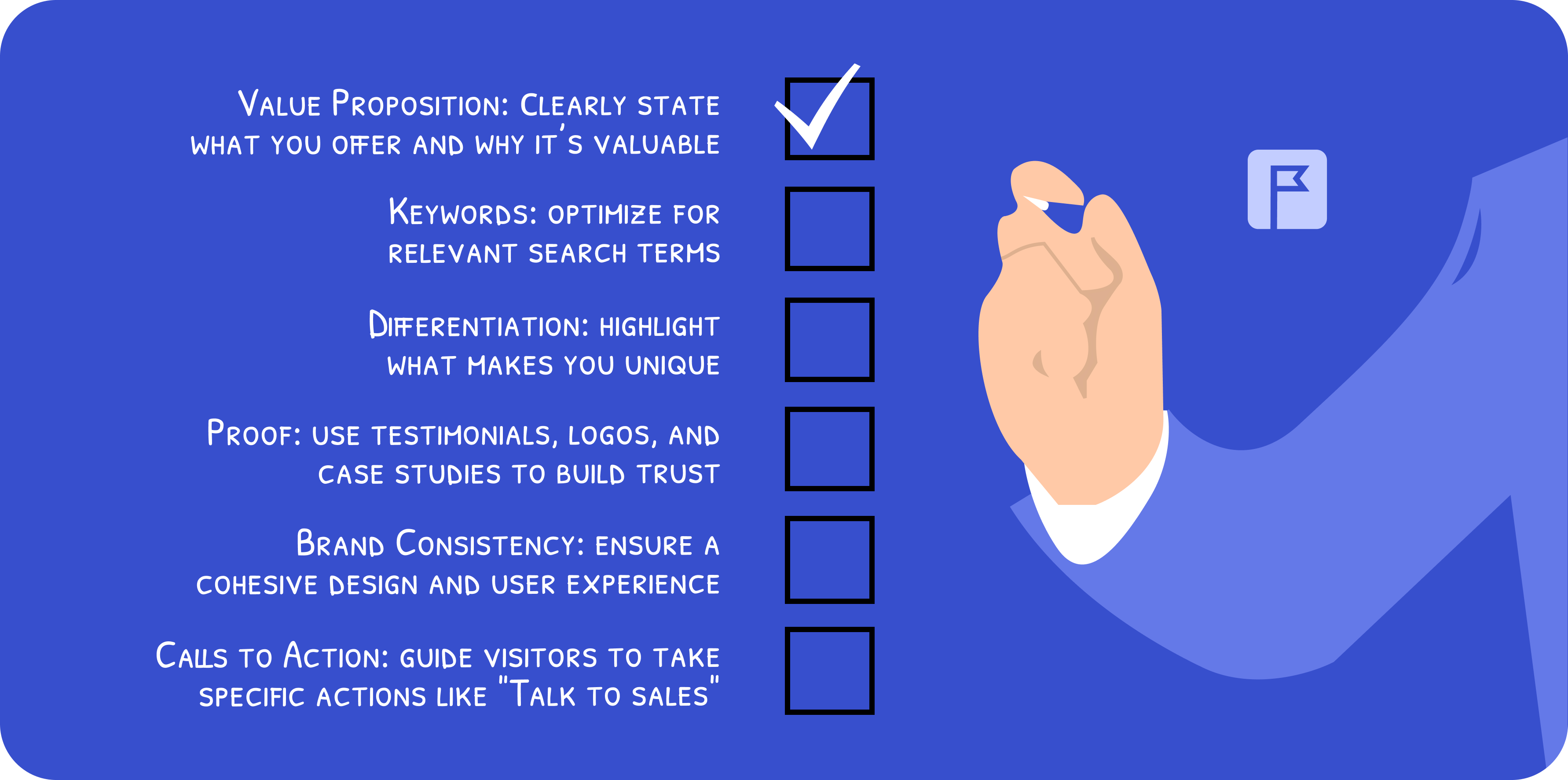
Figuring out what to put on the homepage can be hard. You might put too much stuff, copy things from other pages, or not give your visitors what they really want. So here are six important elements that every blog needs on its homepage:
1. Value Proposition
When a new visitor comes to your homepage, you only have a few seconds to grab their attention. You need to quickly and clearly explain what you offer and why it's valuable. A good value proposition explains the problem you solve, tells who you solve it for, and showcases your brand’s personality. It should reassure visitors that you can help them while making it clear what your business is about. To make your value proposition effective, be clear, honest, brief, and engaging in your homepage text.
2. Keywords
Creating a great message is important, but you also need to think about how people find your blog through search engines. Your homepage should be optimized for keywords that potential customers might use when looking for solutions. Focus on keywords that are relevant to your business. Include these keywords in important places like the main heading (H1), meta description, and throughout the text where it fits naturally.
3. Differentiation
Even if your value proposition catches a visitor’s attention, they need to know why they should choose you over others. This is where differentiation comes in. Explain what makes you unique and better than the competitors. Your uniqueness could be in your product, service, customer experience, company culture, or how you meet specific needs.
4. Proof
Showing proof that you can deliver on your promises helps build trust and convince visitors to take action. This is especially important in business-to-business (B2B) sales.
Common ways to show proof include customer logos, testimonials, and case studies. Use these to demonstrate your success and reliability.
5. Consistent Brand Application
Your homepage should feel cohesive and unified as visitors navigate through it. Avoid having sections that feel disconnected or inconsistent in design.
Make sure every part of your homepage reflects your brand’s image, creating a smooth and consistent user experience.
6. Calls To Action
Calls to action (CTAs) guide visitors toward your blog's goals. Place CTAs in logical and easily accessible spots, like the website navigation.
Your CTAs should match your main objectives. Focus on clear, high-intent actions such as:
- Talk to sales
- Book a demo
- Free trial
Talking about CTAs, how about joining HilltopAds to improve your CPA campaigns in no time? We’ll make sure you get only the best traffic for your homepage and website overall.
How A Good Homepage Helps To Drive Traffic
Publishers can create a homepage that not only attracts visitors but also keeps them engaged, while also receiving a great bonus such as higher traffic and better reader retention. Let’s see how it works:
- Effective SEO: a good homepage that is optimized for search engines with appropriate keywords, meta tags, and descriptions. This makes it easier for potential readers to find the site through search engines, increasing organic traffic.
- Navigation and structure: an intuitive layout and clear navigation make it easy for visitors to find content. Categories, tags, and search functionalities help users quickly locate articles that interest them specifically, improving user engagement and retention.
- Proper content presentation: highlighting popular articles, recent posts, and featured content on the homepage attracts visitors and makes them want to read more. Visual elements like images, videos, and infographics can also enhance engagement.
- Mobile optimization: an optimized homepage design ensures that content is accessible and easy to read on all types of devices. This is particularly important, taking into account that 60% of users online use mobile phones to access the digital world. This improves user experience and can boost traffic from mobile searches.
- Call to actions (CTAs): Strategically placed CTAs on the homepage, such as newsletter sign-ups, subscription offers, or download links, can make visitors into regular readers or subscribers, increasing return traffic.
- Fast loading speed: a fast-loading homepage reduces bounce rate and makes the overall experience pleasant. Search engines also rank fast sites higher, leading to better visibility and increased traffic.
Effective Homepage: a Key to Advertising
You might have noticed that blogs are quite a popular online space to place an advertisement. There are several factors why that works:
- Visibility: a good homepage attracts more visitors and increases the visibility of advertisements placed on the site. Higher traffic means more potential views and interactions with ads.
- Ad placement: a well-organized homepage provides strategic locations for ad placements, ensuring that ads are visible without being too noisy. This can improve the effectiveness of the ads and increase advertiser satisfaction.
- Responsive design: a mobile-friendly homepage ensures that ads are displayed correctly on all devices. As mobile traffic continues to grow, responsive design helps to grab the attention of a wider audience for advertisers.
- Interactive ads: features like interactive banners, video ads, and pop-ups can be more effectively integrated into a well-designed homepage leading to higher user interaction and ad performance.
- Brand safety: advertisers want to ensure their ads appear on reputable sites. A well-maintained homepage is a good sign of a trustworthy and high-quality partnership. A suitable homepage reduces the risk of losing potential advertisers.
Blog Homepage Examples That Actually Work (And Why?)
So the theory is all good but how about looking into some practical examples of interesting ideas for homepages?
1. Timothy Sykes

Timothy Sykes might not be a well-known blogger, but he’s an incredibly successful penny stock trader (think Wolf of Wall Street). The reasons why his home page works are many, we’ll focus on the core ones.
- Compelling headline: the homepage grabs attention with a bold headline: “I'm Tim Sykes, a penny stock trader with $7.6 million in documented earnings over 20-plus years.”
- Effective CTA: there’s also a strong call to action “Learn the Formula From These Top Penny Stock Trading Experts” that encourages visitors to click and learn more.
- Social proof: Timothy uses social proof effectively. For example, he places the headline “How My Top Students Became Millionaires” and attaches the following articles.
- Simple yet effective design: while the design isn’t fancy, it’s easy and functional and that converts a lot of traffic.
2. Jeff Goins
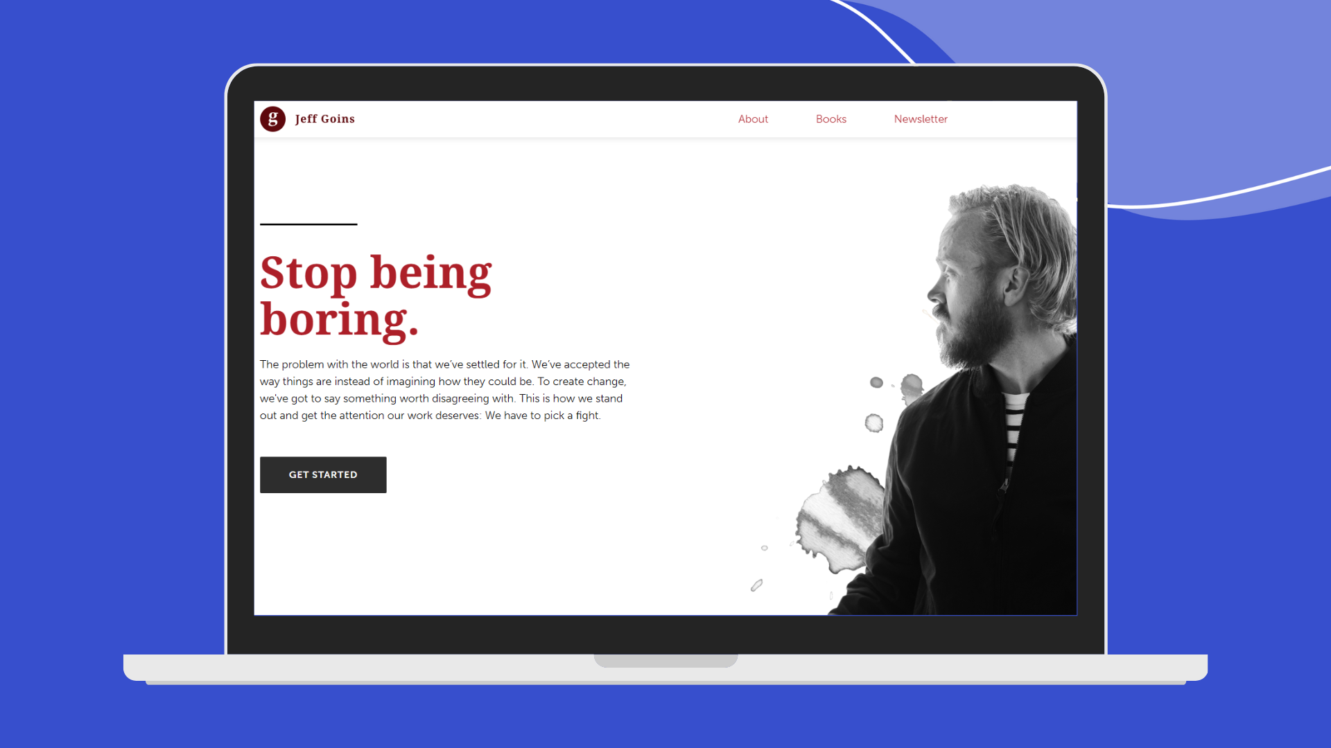
Jeff Goin, undoubtedly, is one of the most renowned writers. Jeff also aims for simplicity and ease of reading. His homepage is uncluttered, grounded in a solid foundation.
- A feature box aimed at collecting email addresses.
- Quick testimonials from top industry influencers to build trust.
- Links to the blog, podcast, and social media sites.
Despite not having a fancy and expensive design, it’s still one of the best homepages out on the internet. It shows that sometimes it’s better to have fewer features and focus on building your email list with your homepage. They say sometimes the less is more for a reason.
3. Derek Halpern

Derek Halpern is one of the smartest internet marketers. On his blog, Social Triggers, he shares how he builds his business using proven principles of psychology and persuasion.
The Social Triggers homepage focuses on connecting with visitors and encouraging them to subscribe. Take a look at the reasons why it works.
- Faces: Derek uses the psychological principle that people pay more attention to faces by prominently displaying his image.
- List building: the homepage prioritizes list building with several different CTAs throughout the page “Get with the free program, will ya?”, “Click here to subscribe”.
- Social Proof: Derek influences visitors by showcasing social proof, including prominent testimonials and feedback such as “I very much enjoy your webinars, thank you so much. AWESOME JOB DEREK!”.
These elements combined make the homepage effective at engaging visitors and converting them into subscribers.
4. Smart Blogger

You don't have to spend a lot on web designers for your homepage, especially when you're just starting out. Your homepage should focus on two main things: getting email subscribers and building trust.
Take Smart Blogger for example. Their homepage isn't fancy, but it's effective. Visitors land on their page and immediately see the content. They prioritize building their mailing list, as seen from their feature box. Supported by the contrast “start now” button and short and comprehensive catchphrases like “Get paid to write”, “Work from anywhere”, and “We're seeking writers of any skill level” they manage to use their 10–20 seconds just about right.
5. Enchanting Marketing
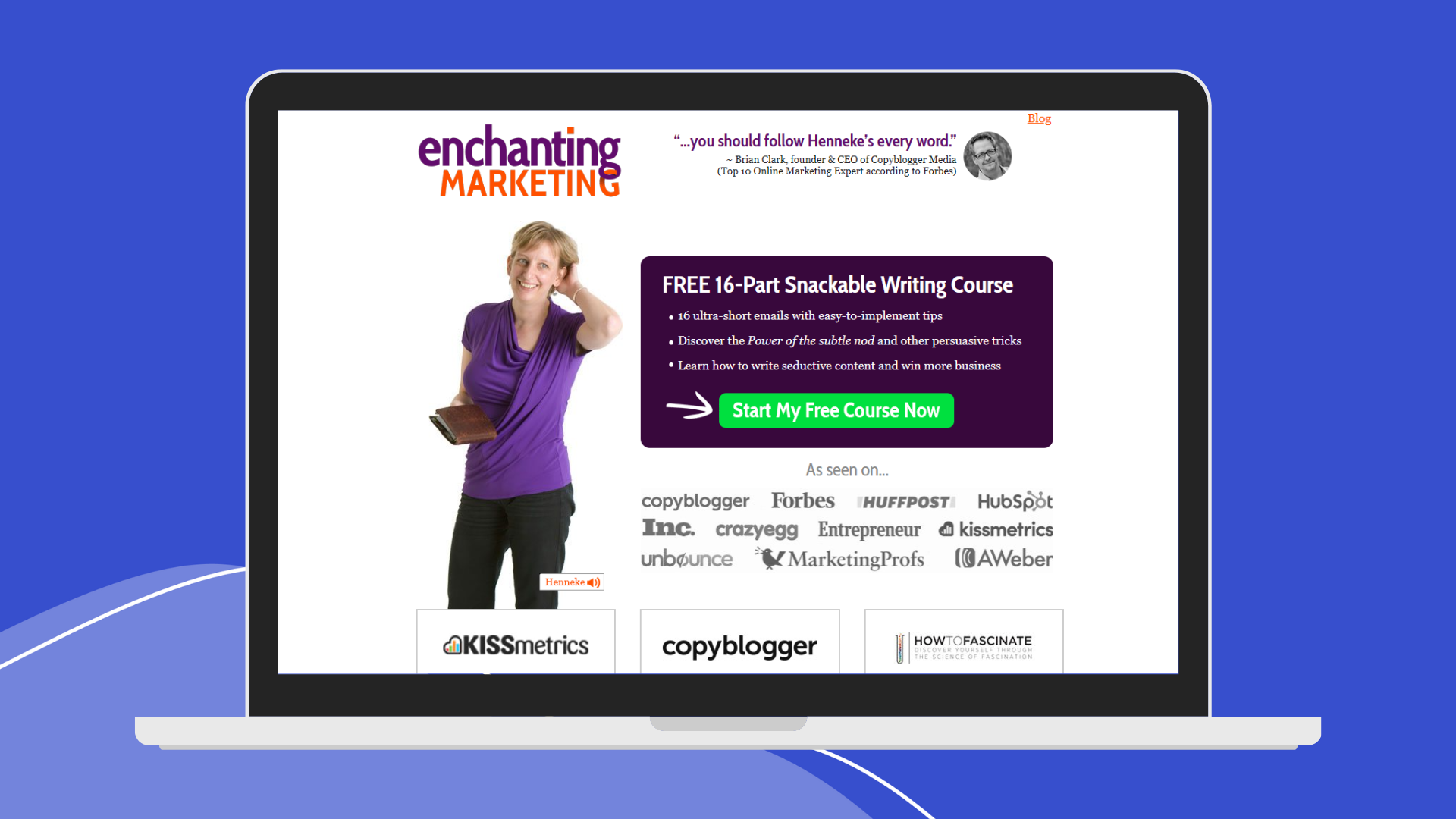
If you're on a tight budget, consider adding a feature box like Smart Blogger. However, in some cases, it's worth stretching your budget a bit more to invest in a landing page like Enchanting Marketing did. Set a landing page as your homepage with a small link to the main blog.
Look at Enchanting Marketing as an example. Their homepage is a simple landing page with a small link to the main page at the top.
Why It Works
- Landing pages are the best for conversions.
- Unlike basic landing pages, Henneke uses her image (and voice greeting), which builds trust and encourages subscriptions.
- Social proof is placed strategically throughout the page, making it trustworthy.
This setup ensures your homepage attracts more email subscribers. It still links to the blog and converts visitors interested in your subscribers.
Closing words
While making the perfect homepage for your blog, remember that it's not just about aesthetics but about functionality and engagement. Your homepage is like the front door to your blog, giving visitors an opportunity to take a look at what you can offer.
Keep it clean, user-friendly, and reflective of your brand identity. Include clear navigation, visuals, and brief messaging to guide visitors through your content. By prioritizing readability and accessibility, you'll ensure that every visitor finds value in exploring your blog further.
With these tips in mind, you'll create a homepage that attracts your audience and keeps them coming back for more. Happy blogging!
FAQs
How to come up with a good website design?
To create a great website: First, figure out what your brand is about and make sure your website matches. Use the same colors, fonts, and pictures throughout. Think about who will visit your site and make sure it's easy for them to find what they need. Add interesting graphics to make it more engaging and enjoyable for users.
How to create a blog style of my own?
Creating your own blog style begins with understanding your niche and audience. Select a blog platform and personalize a template to reflect your blog. Create and share engaging, consistent content, using your unique style and visuals. Change and adapt your design with your blog’s growing.
How to design a modern blog?
When designing a modern blog go for a more sleek layout, minimalist color palette, and high-quality visuals. Prioritize intuitive navigation and mobile optimization, while integrating social sharing options and multimedia elements like videos and infographics.
